It’s happened again. You’ve decided to make something, but you’re not sure what exactly it should look like yet. You pull out your favourite tool for wireframing, and spend a few minutes doodling. Sometimes that works, but sometimes it doesn’t. Quite often, you run right into a wall. Damn. Stuck again.
What now?
One might think to use one of those fancy online mockup tools, but I find they tend to be only decent at arranging a limited set of predefined components. There are times when you need to make something that they haven’t thought of yet. This is one of the times when getting some actual sketching done can make a lot of difference to your workflow and final results.
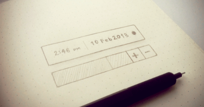
Wondering how to sketch? Let’s make this a concrete example. Just the other day, I had to come up with a solution to the problem of entering a time or date in the future, a range of some sort, into an application. Most people would just end up plopping down two calendar views, and screaming “job done!” at the top of their lungs. However, on some rare occasion, you might actually have a reason to do better than that.
So, we have a problem; a time range input. Let’s get that licked in no time.! Yeah right…
Tools
Before venturing out into the design unknown, it’s probably a good idea to fill your rucksack with some gear.
In my case, I’ve found that using a dot-grid notebook helps when you need to design something with rigid proportions. Otherwise, a plain notebook is works well enough. I also have a tablet for when I’m at my desk, and want some flexibility with colour without the clutter and overhead of having to deal with a collection of colour pens.
Get a decent pencil. This might sound like an indulgence, but I’ve found that having decent pencil means you don’t have to worry about it acting up unnecessarily–that’s one less thing to worry about. In my case, I have the rOtring 600 Black Mechanical Pencil 0.5 on the recommendation of my friend Kyro.
A process
Quite often the hardest part of sketching just about anything is getting past the blank sheet of paper in front of you. The way you avoid that is to keep around a piece of paper labelled “scratch paper”, and convince yourself that anything drawn on it is absolutely disposable. That’s the paper you’ll use for warm-ups sketches which will probably look like utter crap.
It’s perfectly fine to promptly toss those preliminary sketches into the wastepaper basket once you’ve gotten a sense of the direction you want to take things. I’d show you mine, but they’re at the bottom of the bin, just like yours will be. You just keep going until you’re out of time, and figured out something that works. It doesn’t have to be perfect at the first try. Design in an interative process. It will improve with feedback from users.
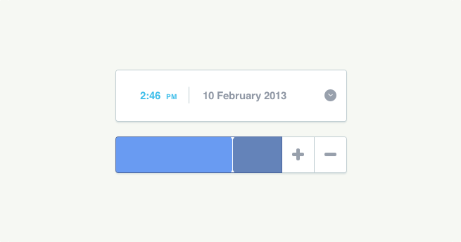
In this case the idea is that “you click and drag on the slider to pick a time range offset from the preset, use the +/- buttons for more fine grained control, and click the clock area for a drop down with presets in it”. Details like these will go into your notes drawn beside the sketch (or elsewhere, as you prefer).

If you’re concerned that your sketches don’t look like mine, don’t worry about that. It just take a bit of practice. Besides, drawing pretty pictures is a non-goal in this case. Solving UI problems is the goal.
“We work because it’s a chain reaction, each subject leads to the next.” – Charles Eames
Another thing that might be useful to do is to make a checklist of the most important aspects you wish to capture in whatever you might be designing. An example list might include; mobile support, accessibility (this should probably be on every checklist you make) and flexible proportions. Above all, remember to take into consideration the context in which it will be used.
When you’ve figured out to some extent what your solution will look like, then you can switch to your design app of choice and render out something that looks a little better than your sketch. Of course, it’s perfectly fine to jump straight into code, but sweating the details in a design app can sometimes help.

Well, now that you’re done, there’s nothing stopping you from shipping it off to Dribbble or more importantly get it converted into code, test it out, and iterate until you’ve gotten it just right.
Postscript
If you’re like me and spend time on both sides of the fabled designer-developer divide, I might have a Dribbble invite for you. I still have three at the moment. So, send me a message with a GitHub profile and some design work. Let’s see how it goes. They’re all gone now.
Also, if there’s some interest, I’ll probably do a follow-up article on actually building custom controls for iOS and the web. Let me know
Update
There are signs of some discussion over on HN, DN and Dribbble.